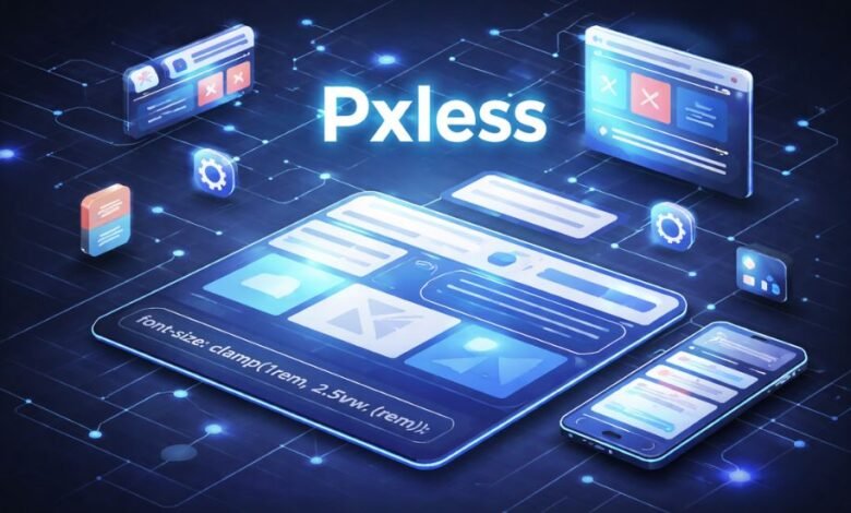
The word pxless shows up more and more in conversations about modern digital design, web development, and even product strategy. At its core, pxless refers to an approach that avoids relying on fixed pixel measurements (“px”) when building layouts, interfaces, or visual systems. Instead of locking designs into exact pixel sizes, pxless thinking favors flexible, relative measurements that adapt to different screens, devices, and user preferences.
To understand why this matters, it helps to remember where pixels came from. Early screens had limited variation. Designers could assume a narrow range of resolutions, and “pixel-perfect” layouts made sense. A button might be exactly 120 pixels wide, text might be set to 16 pixels, and spacing could be defined with absolute certainty. That mindset carried over for years and shaped how many teams still work today.
But screens changed faster than design habits. Phones, tablets, laptops, ultrawide monitors, smart TVs, and accessibility tools all display content differently. Pixel density varies. Users can zoom text, adjust system font sizes, or use assistive technologies that change how content is rendered. In that environment, rigid pixel-based layouts often break down. Text becomes too small, elements overlap, or designs feel cramped on some devices and oversized on others.
Pxless is essentially a response to that reality. It is not a tool, a product, or a single rule. It is a mindset that asks a simple question: instead of forcing everything into fixed pixel boxes, can layouts respond more naturally to the space and the user? For many designers and developers, pxless represents a shift away from control toward adaptability.
This idea has also spread beyond purely visual concerns. Some people use pxless to describe broader system thinking: building interfaces, dashboards, or digital products that scale smoothly as conditions change. In that sense, pxless aligns with how modern software is expected to behave—flexible, resilient, and user-aware.
At Empire Magazines, we often see readers curious about whether pxless is a trend, a best practice, or just a buzzword. The answer is nuanced. Pxless is not a replacement for all pixel use, nor is it a strict doctrine. It is better understood as a practical response to the complexity of today’s digital environments.
How pxless works in practice, without technical jargon
Although pxless sounds technical, the core ideas are easy to grasp without diving into code. Imagine arranging furniture in a room. One approach is to measure every item to the millimeter and lock it in place. That works if the room never changes. Another approach is to think in proportions: this table should take up about one-third of the room, chairs should fit comfortably around it, and walking space should remain flexible. If the room is larger or smaller, the arrangement still works.
Pxless design follows the second approach. Instead of saying “this text is exactly 16 pixels,” designers might say “this text should scale relative to the base font size” or “this section should take up a certain percentage of the available space.” The result is a layout that breathes rather than one that feels frozen.
A common conceptual example is typography. In pixel-based systems, increasing text size can cause problems: headings may overlap, containers may not expand, or layouts may break. In a pxless system, text scales smoothly because spacing and container sizes are tied to the text itself. If the user needs larger text for readability, the design adjusts naturally.
Spacing works the same way. Instead of hardcoding margins and padding in pixels, pxless layouts define relationships. For example, the space between paragraphs might always be proportional to the text size. This creates visual consistency across different screens and user settings.
Importantly, pxless does not mean “no structure.” Some critics assume that abandoning pixels leads to messy or unpredictable designs. In reality, pxless systems often require more planning upfront. Designers must define rules, scales, and constraints that guide how elements behave as conditions change. The payoff is long-term stability and fewer edge cases.
This approach also encourages teams to think in systems rather than one-off screens. Instead of designing a single perfect homepage at one resolution, teams define reusable components that adapt wherever they appear. Over time, this reduces maintenance work and makes products easier to evolve.
That said, pxless does not forbid pixels entirely. There are situations where precise control is useful, such as aligning icons, fine-tuning borders, or matching visual assets. Pxless thinking simply discourages overreliance on fixed values when flexibility would serve users better.
Benefits, limitations, and common misconceptions
One reason pxless has gained attention is its practical benefits. The most frequently cited advantage is accessibility. When layouts are built with relative sizing, they respect user preferences. Someone who increases text size due to vision needs is less likely to encounter broken layouts. This is not just a design preference; in many regions, accessibility is tied to legal and ethical standards.
Another benefit is consistency across devices. A pxless interface feels more predictable because it adapts proportionally. A card component that looks balanced on a laptop is more likely to feel balanced on a phone or large monitor. This consistency improves user trust, even if users cannot articulate why something feels “right.”
Performance and maintenance also play a role. Pxless systems often reduce the need for device-specific fixes. Instead of creating separate designs for dozens of screen sizes, teams rely on flexible rules. Over time, this can lower development costs and simplify updates.
However, pxless is sometimes misunderstood or oversold. One misconception is that pxless automatically produces better design. Flexibility alone does not guarantee clarity or beauty. Poorly planned pxless systems can feel loose, inconsistent, or visually unpolished. The approach requires discipline, not less of it.
Another misconception is that pxless eliminates the need for design decisions. In reality, it shifts decision-making earlier in the process. Designers must define scales, relationships, and priorities before building screens. This can feel slower at first, especially for teams used to pixel-level tweaking.
There is also a learning curve. Designers trained in pixel-perfect tools may initially struggle to think in relative terms. Developers may need to adjust how they structure layouts and test across conditions. Pxless does not remove complexity; it redistributes it.
Critically, pxless is not a moral stance. Some discussions frame pixel-based design as “wrong” or outdated. That framing is unhelpful. Pixels are still useful, and many successful products use them extensively. Pxless simply expands the toolbox and encourages flexibility where it makes sense.
A balanced view recognizes that different contexts call for different approaches. A marketing landing page with strict brand visuals might rely more on fixed measurements. A content-heavy platform or dashboard may benefit greatly from pxless principles. The key is intentionality, not ideology.
Pxless thinking beyond design: systems, finance, and scale
Interestingly, the pxless concept has begun to appear as a metaphor in broader discussions about systems and scale. While its roots are visual, the underlying idea—avoiding rigid constraints in favor of adaptable rules—resonates in other fields.
In finance, for example, consider how rigid models can fail when conditions change. A hypothetical investment framework that assumes fixed growth rates and static markets may perform well in stable times but struggle during volatility. More adaptive frameworks, which adjust assumptions based on conditions, tend to be more resilient. This is conceptually similar to pxless thinking: design systems that respond to reality rather than forcing reality to fit the system.
This metaphorical use of pxless sometimes appears in discussions around real estate, private equity, or portfolio management. Firms like Ashcroft Capital, often referenced in broader financial conversations, operate in environments where flexibility and responsiveness matter. While pxless is not a financial strategy, the comparison helps explain why adaptability is valued across disciplines.
In legal or regulatory contexts, rigid rules can also create friction. Laws and policies written without room for interpretation may fail to address edge cases or evolving technologies. More principle-based frameworks, while still structured, allow for adaptation over time. Again, the pxless idea helps illustrate the difference between fixed constraints and responsive systems.
It is important to be careful with these analogies. Pxless does not magically solve systemic problems, nor does it replace rigorous analysis. The value lies in the mindset: anticipate change and design with flexibility in mind. When used responsibly, this mindset can complement traditional methods rather than replace them.
For readers of Empire Magazines, this broader perspective matters. Pxless is not just a technical trend confined to designers and developers. It reflects a larger shift in how people approach complexity in a world that rarely stays still.
Where pxless fits today and what to keep in mind
Pxless has gained traction because it aligns with how digital products are used today. People access content in unpredictable ways, on devices of all shapes and sizes, with diverse needs and preferences. Fixed assumptions break quickly in that environment.
At the same time, pxless is not a silver bullet. It requires thoughtful implementation, cross-team understanding, and realistic expectations. Teams adopting pxless principles should start small: apply them to typography, spacing, or layout components before attempting wholesale changes.
Clear communication is also essential. Stakeholders unfamiliar with pxless may worry about losing control or consistency. Demonstrating how flexible systems still produce cohesive results can ease these concerns. Visual examples, even conceptual ones, help bridge the gap between theory and practice.
Testing remains crucial. Because pxless designs adapt, they should be tested across a wide range of conditions: different screen sizes, zoom levels, and user settings. This testing often reveals edge cases that fixed designs would never encounter, but addressing them early strengthens the system overall.
Ultimately, pxless works best when treated as a tool rather than an identity. It encourages designers, developers, and decision-makers to ask better questions about adaptability, user needs, and long-term sustainability. Used thoughtfully, it can improve both user experience and internal workflows.
Conclusion
Pxless is less about rejecting pixels and more about rethinking rigidity. It reflects a growing awareness that digital environments are fluid and that systems built with flexibility tend to age better. By focusing on relationships instead of fixed measurements, pxless approaches aim to serve users more reliably across changing conditions. Like any approach, it has limits and requires care, but its core idea—designing for adaptability rather than certainty—feels increasingly relevant.
Frequently Asked Questions (FAQs)
What does pxless mean?
Pxless refers to an approach in digital design and layout creation that avoids relying heavily on fixed pixel values. Instead, it emphasizes flexible sizing that adapts to screen size, user settings, and display conditions.
Is pxless a technology or a tool?
Pxless is not a specific technology, software, or platform. It is a design philosophy or way of thinking about layout and structure. It can be applied using many different tools or frameworks.
Does pxless mean pixels are never used?
No. Pxless does not ban pixels entirely. Pixels may still be used where precision is necessary, such as icons or fine visual details. The idea is to avoid depending on fixed pixels for overall layout and scaling.
Why is pxless often linked to accessibility?
Because pxless layouts adjust naturally when users change text size, zoom levels, or display settings. This helps ensure content remains readable and usable for people with different needs, rather than breaking when sizes change.
Is pxless only relevant for websites?
While it originated in web design discussions, the pxless concept can apply to many digital environments, including apps, dashboards, and responsive interfaces. The core idea is adaptability, not a specific medium.
Does pxless make design easier or harder?
It can feel harder at first because it requires planning systems instead of adjusting individual elements by eye. Over time, many teams find it easier to maintain and scale because fewer manual fixes are needed.
Can pxless designs look inconsistent?
They can if poorly planned. Pxless relies on well-defined rules and relationships. When those rules are unclear, layouts may feel loose. When done well, pxless systems are often more consistent across devices.
Is pxless a trend or a long-term shift?
Pxless reflects a broader move toward flexible, system-based design rather than a short-lived trend. As devices and user preferences continue to diversify, adaptable approaches are likely to remain relevant.
Do small projects benefit from pxless?
Even small projects can benefit, especially if they are expected to grow or reach users on multiple devices. However, for very simple or fixed-use layouts, a fully pxless approach may not always be necessary.
How can someone start using pxless thinking?
A simple starting point is focusing on relative relationships instead of fixed sizes—such as letting spacing scale with text or allowing layouts to adjust naturally to available space rather than targeting one screen size.